Week 6: Mapping with QGIS
Reading Response
The Wilkens piece1 about mapping 19th century American literature struck me as an example of using mapping technology as a research process, rather than a research result. The project took a corpus of 19th century American literature, extracted the place names therein, and geocoded the results. The results showed, not surprisingly, that as settlers moved West, so did the place names used in their literature. The data puts some empirical values on that common-sense observation, but does not change the overall conclusion. There were some minor observations of interest that could not have been made without the help of the computer to crunch the amount of data, but without more detail, it was difficult to get excited about his research. However, the project could still be useful in that it leads to additional insights at the more detailed level. For example, his observation that West Texas was more represented before the Civil War than afterward might lead to a more in depth exploration of literature and settlement patterns in West Texas.
The Gregory and Hardy piece2 similarly seemed to quantify what we already knew – that newspaper mentions of the terms war, government, and money were co-located with place names where there was war, government, and money. I am being a bit unfair, I know. The piece was more interesting to me for showing what could be done with the combination of GIS and text mining technologies, rather than for its results. I got a flavor of how text mining works, how much data cleaning and correction is needed before the machines can get to work, and using a gazetteer to match place names to GIS coordinates.
Using QGIS
This time, I wanted to plot the sites on the UNESCO World Heritage List using QGIS.
My plot of World Heritage sites looked like this:
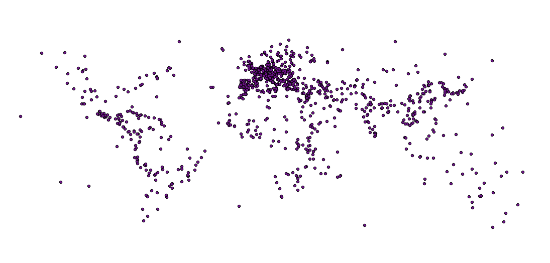
Wait, this is just a bunch of dots! Where’s my map?! Unlike Google Maps, QGIS (and ArcGIS) does not display maps – it displays data. You need to add a map layer to plot this bunch of dots against. I downloaded a free one from Natural Earth Data and voila:
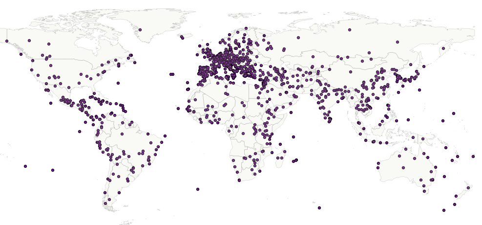
That’s more like it.
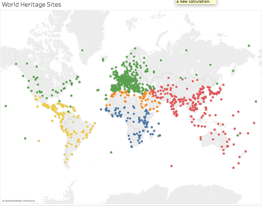
Using Tableau
For this type of exercise – taking a simple csv data set and plotting on a map – I think Tableau is a better tool. Tableau is not only easier to use for those uninitiated in GIS, the output is richer too. Within Tableau, you can switch between using charts or maps to view your information without having to load the csv file into a new tool. It is also fun and easy to switch the type of chart to use that is most suitable for your data. Tableau does not do map layers though, and that is where you need QGIS.
Her’s what the World Heritage map looks like in Tableau. Tableau uses Open Street Map for their baselayer.
1 Matthew Wilkens, “Geolocation Extraction and Mapping of Nineteenth-Century U.S. Fiction,” (2011). ↩
2 I. N. Gregory and A. Hardie, “Visual GISting: Bringing Together Corpus Linguistics and Geographical Information Systems,” Literary and Linguistic Computing 26, no. 3 (2011): 297–314. ↩