Week 5: Digital Spatial History
People have been making maps from the beginning of time and historians have always used maps to make sense of history. Maps are historical artifacts that can show what a specific culture or domain thought was important about their geography. Ship pilots used portolan maps that drew coastlines in great detail and added windrose lines to designate routes. These maps do not use any projection, never mind the ubiquitous Mercator projection. Medieval T-O maps placed Jerusalem at the center with the east at the top. Maps showed what the map designer did or did not know or imagined to be there – terra incognito, creatures real and imaginary inhabiting the interior, hypothesized continents, and so on.
Maps are merely one form of information visualization and historians have always used maps in their research. So there is nothing new about spatial history, and yet we perceive GIS technologies as being revolutionary. In some ways there are, if only for the sheer scale of data that they are capable of handling. They also make it much easier to add and subtract layers that allow the viewer to see different representations of the same area.
One downside of GIS technology is the standardization of point of view. We become accustomed to always seeing North at the top of the page (or monitor). The Mercator projection becomes the norm, even though other projections or scales might be more appropriate for the information being conveyed.
GIS-produced maps project an exactitude that may not, in fact, exist in the original data. The focus on coordinates also means that GIS does not capture the richness of a sense of place. Where do you plot the Great Plains exactly? Nor can it capture metonymy: the White House is not a geographic location, but a metaphor or representation of the presidency.
These are criticisms of “mapping as representation” presented by GIS tools. Using GIS tools to undertake “mapping as process,” as described by Gergely Baics here, can still be useful in generating new questions. The data collection and cleaning process (finding coordinates to go with place names) gives the researcher intimate knowledge of the geographic information under analysis. The resulting analysis may also illuminate holes in existing data or new areas of research that other means could not.
Using Google Maps
I followed the Google Maps tutorial from the Programming Historian. Now I know a lot more about UK imports of fat supplies in 1896. Google automatically converted place names into latitude and longitude coordinates and plotted the places and commodities on the map:
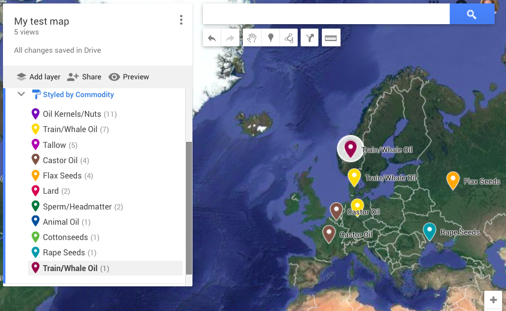
I did not love the results because I had to do more massaging than I expected. The colors for Whale Oil and Castor Oil were the same shade of yellow and I had to manually select another color to differentiate them on the map. You will also note that there are two separate entries for Train/Whale Oil, one with 7 records and one with 1. I checked the data set to make sure they were uniform and they were, so it is not clear why Google thought otherwise. When I used the same data set in Tableau as way to cross-check, it properly extracted eight records without error.